|
In this design, we had to brainstorm and write 15 words that describes my brand and 15 sketches of the logo of my brand. I have chose one of the drawing which has the name of my brand inside which is SMOOTHIE 365, and a drawing of a cherry surrounding the name. Next is a more simple sketch which has the name of the brand and another cherry drawing as the two o's from Smoothie. Last one was a one also with cherry (I could change the fruit) on top of the name of the brand. These symbolize the name and a picture which I thought of when I thought of smoothie. As I talked about it already, the ones circled under are the ones I like. I don't really like the one that's TOO simple such as a smoothie cup and the label of the name just next to it. I could say that the process was actually not bad, but in the middle I kind of ran out of ideas of the sketches like what to draw since it would be too similar to each other. But I actually really enjoyed it since it was fun to create my own sketches and creating my own brand. 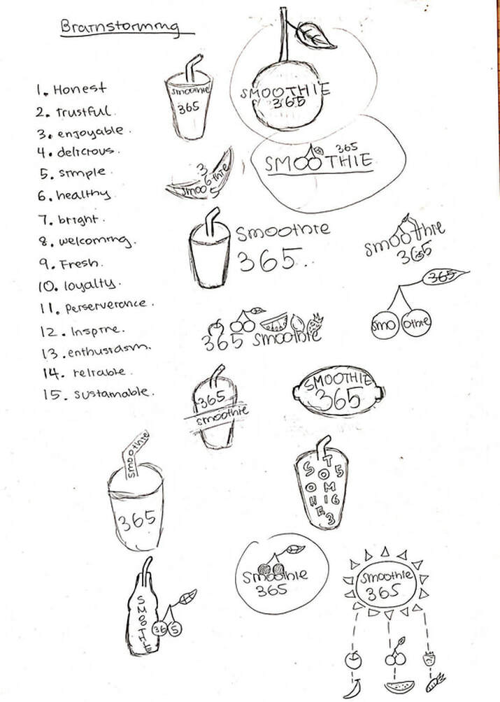
0 Comments
Leave a Reply. |
AuthorHi, my name is Karis. This blog is used for my photography class! Archives
October 2019
Categories
All
 This work is licensed under a Creative Commons Attribution-NonCommercial-NoDerivatives 4.0 International License. |
 RSS Feed
