|
My favorite photo from the 15 photos I took is the Namsan tower. I think the photo was clear with the pretty scattered clouds around it. The most challenging thing about this challenge was finding pictures that would stand out from the background. Something I learned from this challenge is that your background being blurred a bit is good to find your focal point. Focal point: big rock Focal point: bird house Focal point: sunlight
Focal point: house/tower Focal point: squirrel Focal point: purple flower Focal point: cloud Focal point: Juliana Austin Focal point: school bus Focal point: red/pink flower Focal point: Namsan tower Focal point: elephant statue
0 Comments
ISO 800 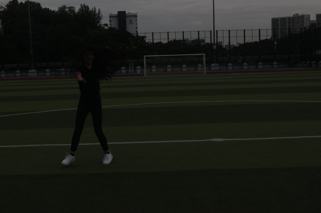 ISO 3200 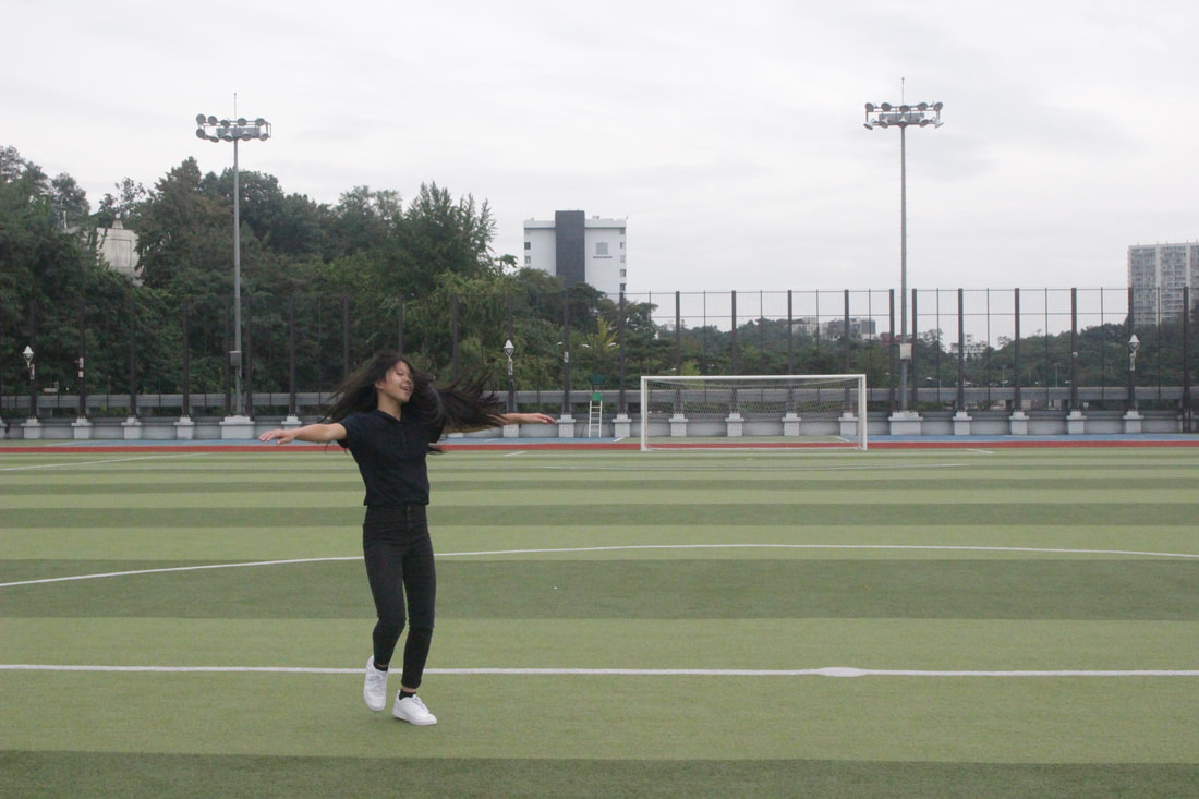 ISO 12800 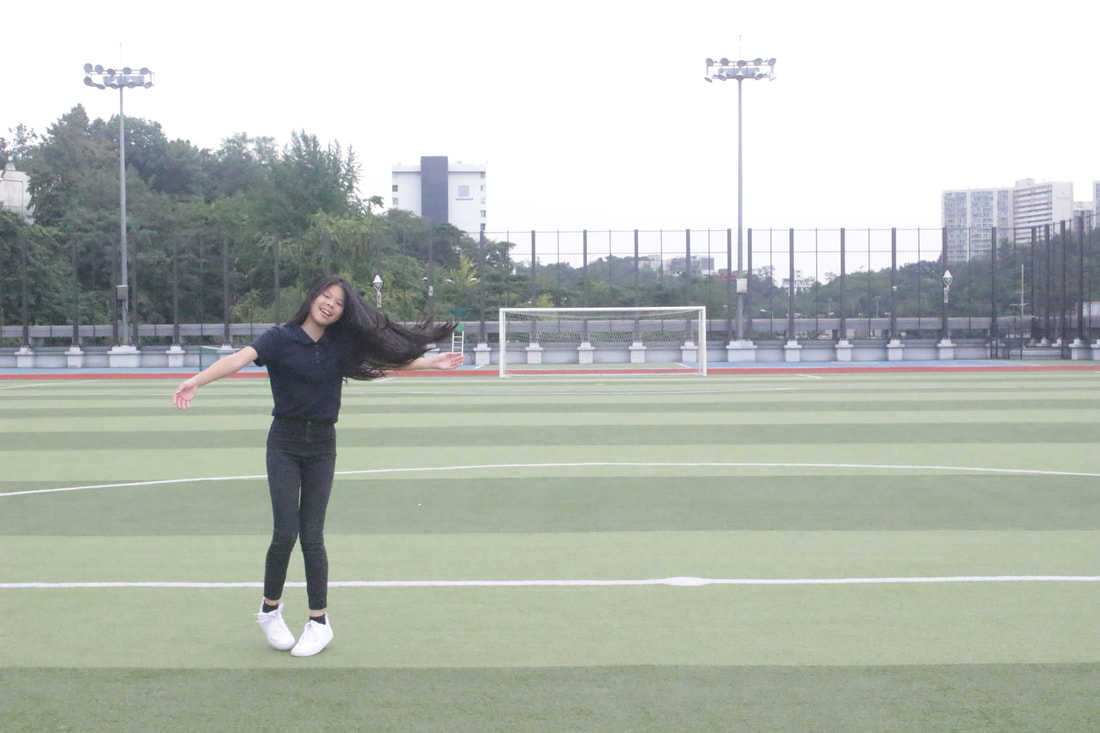 1/4000 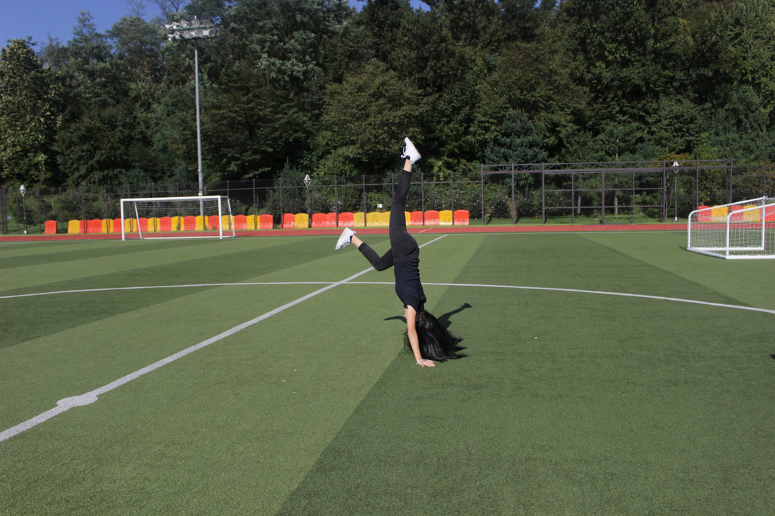 1/500 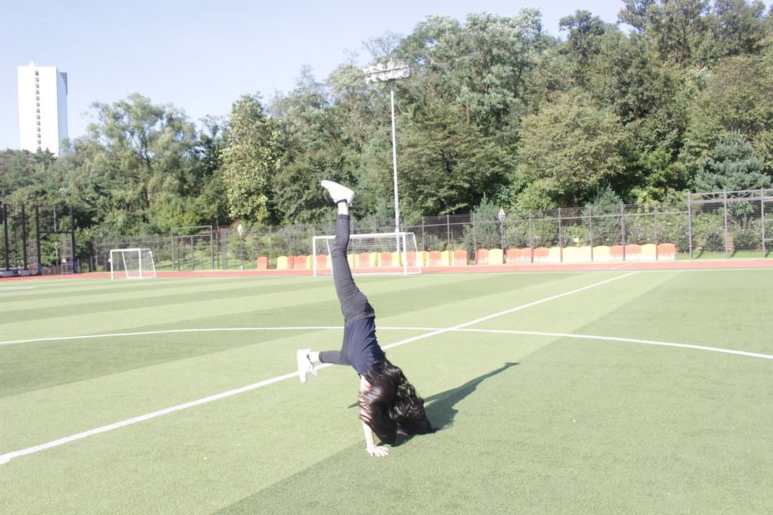 1/15 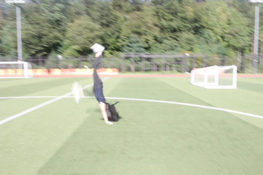 AV Mode I used the AV setting which stands for Aperture Priority Mode. AV is a mode which the user chooses an aperture setting manually while the camera automatically adjusts the shutter speed. I used AV instead of TV since when I took the picture, there were plenty of light. I would have to control the depth of field but since I don't have to adjust the shutter speed, it will be faster and easier to take a picture.  Portrait Mode I used the Portrait mode. Portrait mode makes your subject's face stand-out, make it sharp, while making the background appear blurred. The place (field) we went to take the pictures for this project had good background which were clean like without much obstacles that would distract when taking pictures. By using the portrait mode, it looks more professional and the blurred background is very useful for the portrait subject. 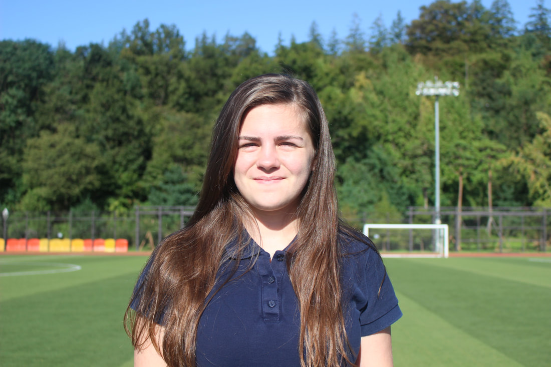 Sports Mode Sports mode is the mode to use to take better pictures of an action or when playing a sport. I decided to use Sports mode since the playground area was near which I thought would be good to take a picture of running around near the playground. Sports mode is usually automatically set the camera to increase shutter speed so that it could freeze/stop the action in the frame for a bit. 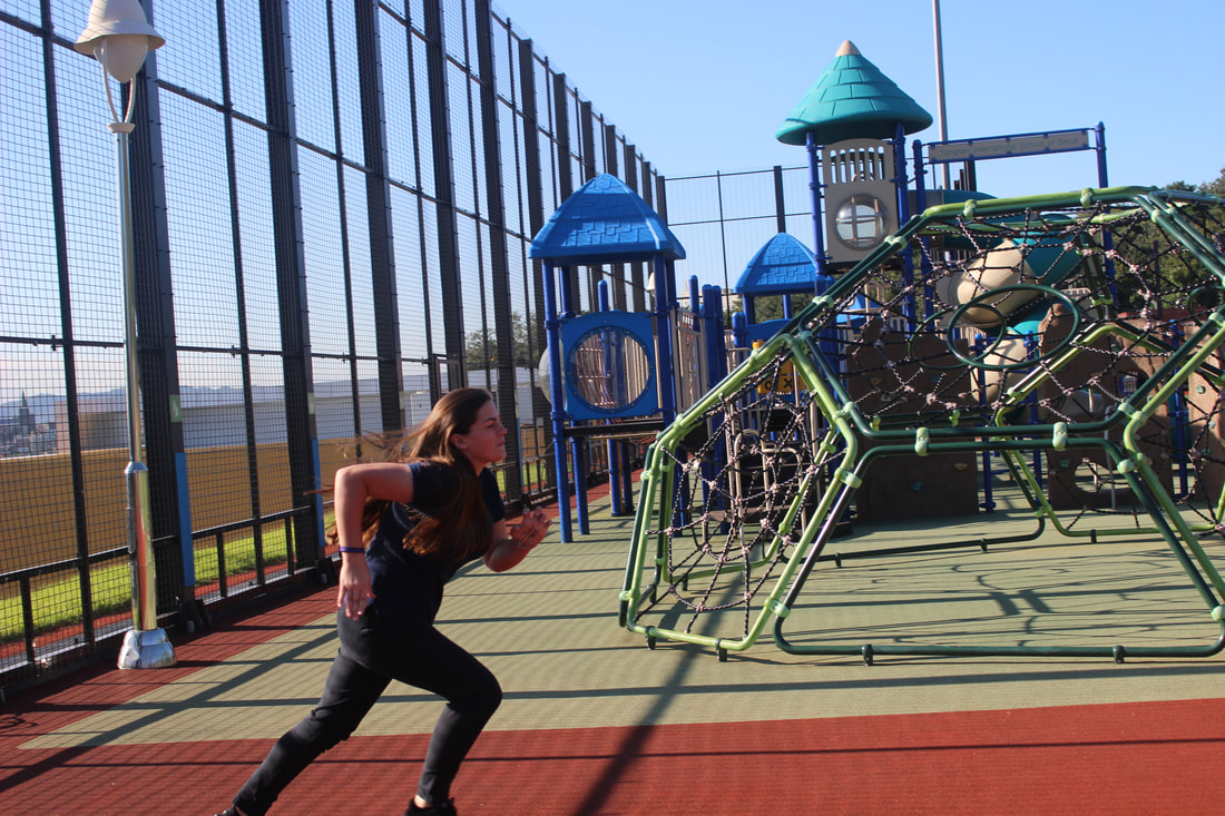 I really liked this assignment. It was kind of hard since there were little problems while I was doing this. This is the exact same wording and sources as the last blog but this time I added in 3 images. This is the Neocities link: kakaris24.neocities.org/    This time, I was supposed to create a Webpage about me! I got this dashboard and the website I made was called "Neocities", this is the link to mine: kakaris24.neocities.org/. I learned how to add links by html code/tags. 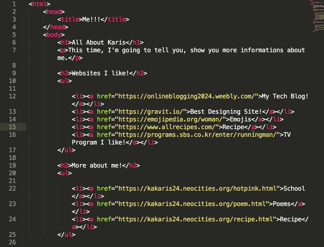 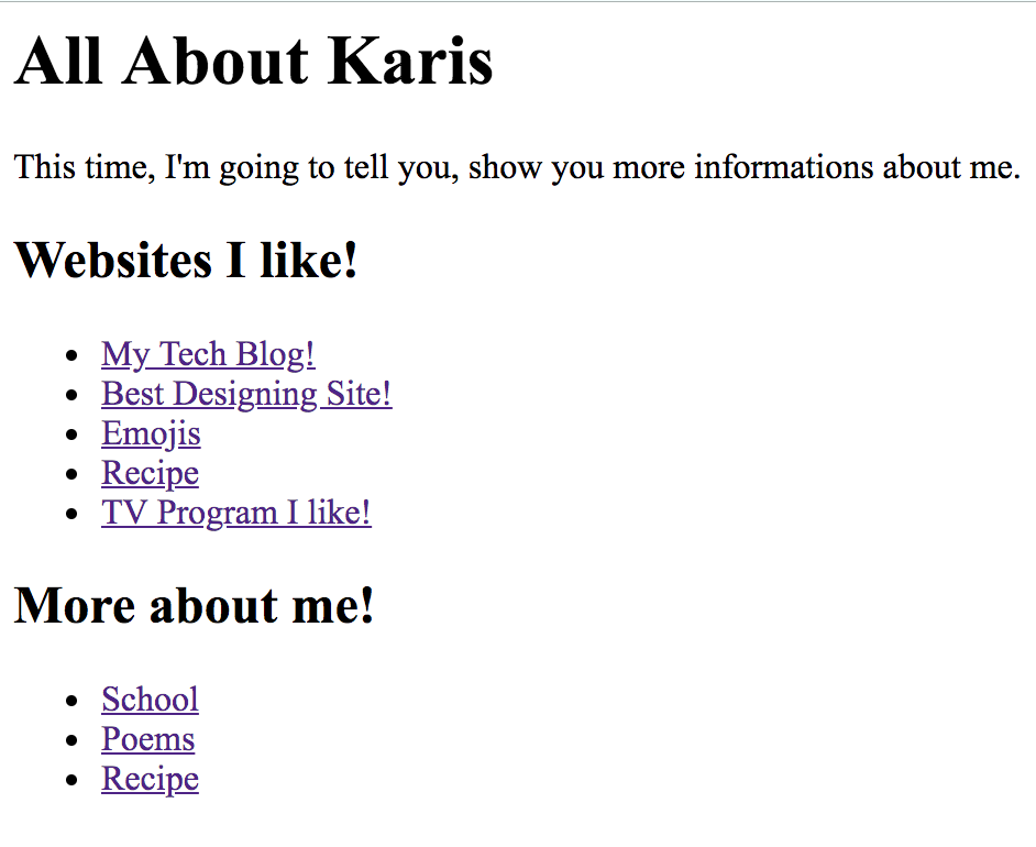 This time, we have to make a recipe page and I chose to do cheese toast! It was fun to learn about ordered list and unordered list. 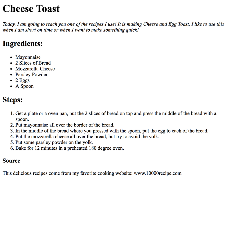 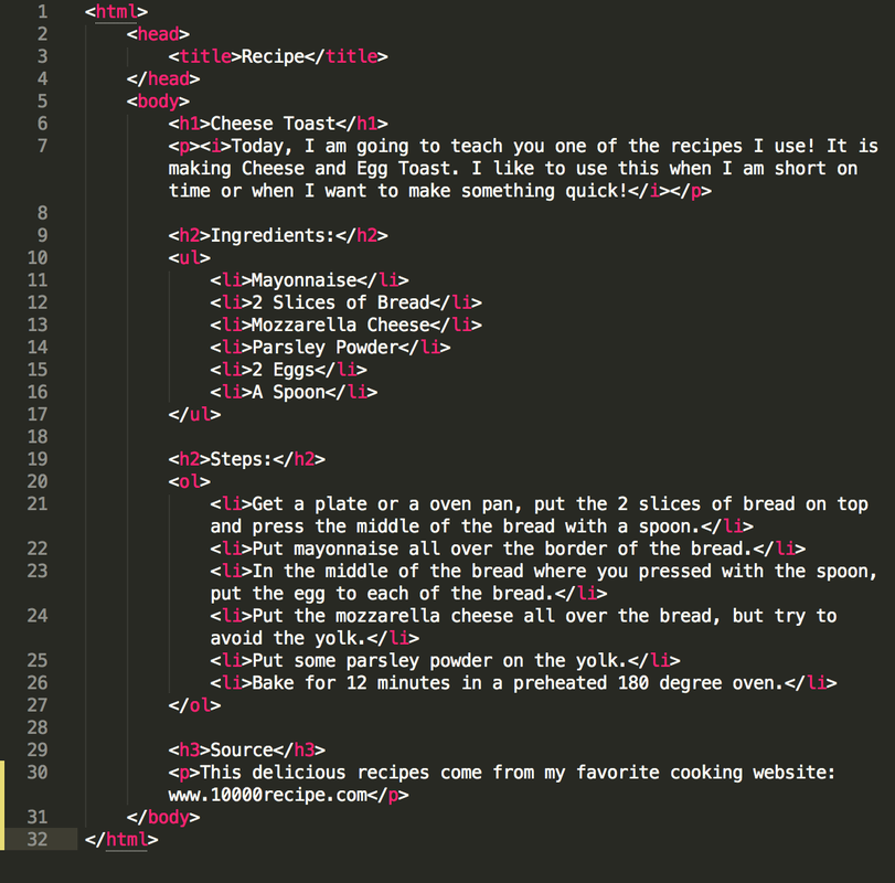 This time, I got a chance to create a poetry page including 3 poems. We had to use bold/italic tags, line break tags, and horizontal rule tags. It was kind of hard for me since I don't really enjoy to create poems and it took me time to find the rhyming words and the topics to write about.  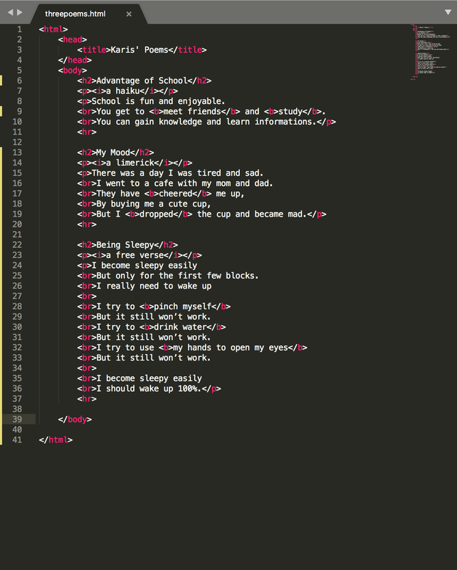 I think that this was a really good experience for me to have. I didn't really know about the HTML structure but I got to know about it better. It was confusing at first but as I followed the video, it made more sense and I got how to do it.     In this project, we have already sketched and created our 15 logos. Out of those, we had to choose 3 logos that we liked and make 3 variations of them so in total, there would be 9 variation of designs. I really loved this project since we were able to like basically play around with the logos we made and improve them with colors, fonts and different tools we learned. Most frustrating thing was that I prefer creating my own fonts than just using a font so then I had to trace them (I used the pen tool) so it was kind of challenging and frustrating at the same time. My favorite thing was creating and tracing different fruits. Since I am doing a smoothie logo, I thought it would be good to use some fruits in my logo, so I decided to find a picture and trace the fruit and use them as part of my design which actually turned out well. I learned that I can be creative with my logos, use different pictures (which I create or trace), different colors and different fonts; I can be VERY creative with it. My favorite logo is the one at the right in the middle with many fruits. It took me like mostly the whole class, since I was also revising and tracing the work.  The name of my brand is 'Smoothie 365'. I was thinking of the word Smoothie before, since it's a smoothie shop, I thought it would be nice to have the word Smoothie in the brand name. Then, I started thinking about a word/number that would fit with the brand and then I somehow just thought of 365. Purpose of my brand is to make the customers get bright, like happy and make them enjoy and have fun. My logo represents the brand since it has the name 'Smoothie 365', and it has a smoothie cup and some fruits inside which tells that it is healthy and tastes also good at the same time. This logo was my favorite and I chose this because I thought that this represented my brand well the most and I thought it didn't look THAT simple and seemed more creative. 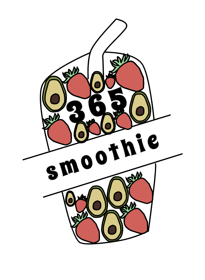 In this design, we had to brainstorm and write 15 words that describes my brand and 15 sketches of the logo of my brand. I have chose one of the drawing which has the name of my brand inside which is SMOOTHIE 365, and a drawing of a cherry surrounding the name. Next is a more simple sketch which has the name of the brand and another cherry drawing as the two o's from Smoothie. Last one was a one also with cherry (I could change the fruit) on top of the name of the brand. These symbolize the name and a picture which I thought of when I thought of smoothie. As I talked about it already, the ones circled under are the ones I like. I don't really like the one that's TOO simple such as a smoothie cup and the label of the name just next to it. I could say that the process was actually not bad, but in the middle I kind of ran out of ideas of the sketches like what to draw since it would be too similar to each other. But I actually really enjoyed it since it was fun to create my own sketches and creating my own brand. 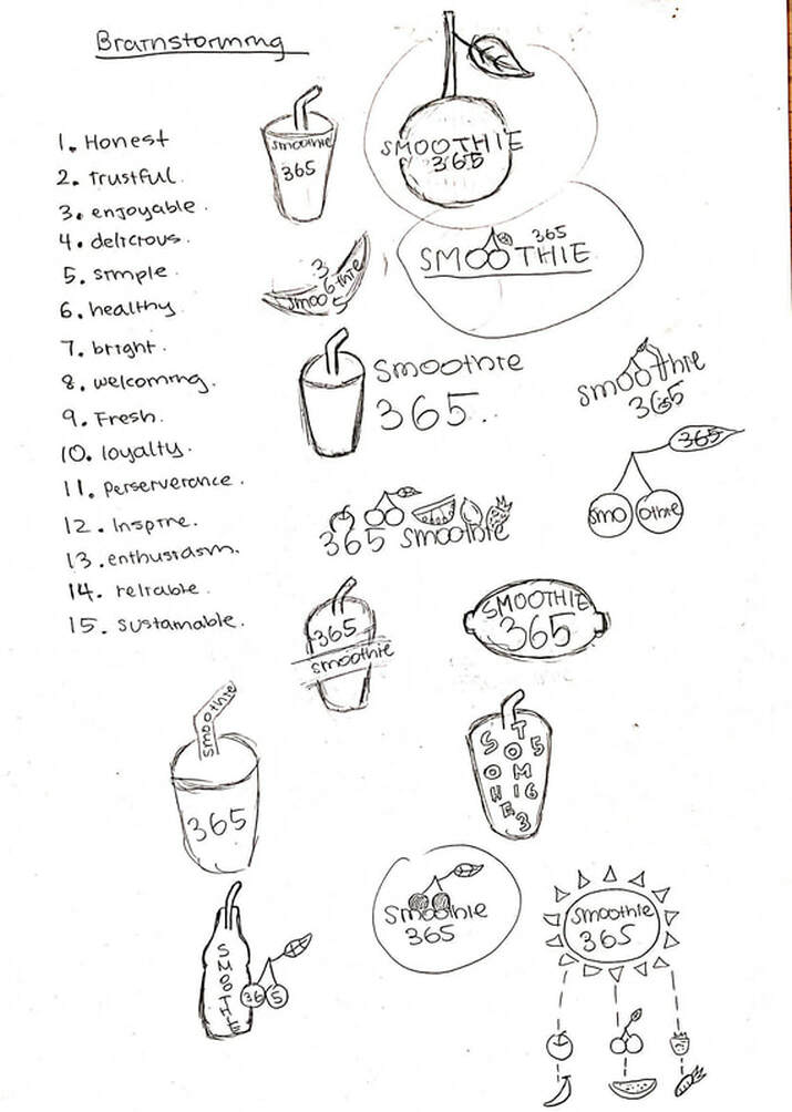 In this assignment, we were suppose to use this website called Adobe Color and make different color schemes. We used Monochromatic, Analogous, Triad, and Complementary. Each of them would give five different colors and we had to use the hex code, paste it in Gravit (to the color hex code part) to the design we made and also label the hex code somewhere in the design. This is the website called Adobe Color which is the website that we created different palettes. I will briefly explain about the four different color schemes we've used and learned. Monochromatic is one hue, but with various saturation and brightness level. Analogous is hues that are next to each other on the color wheel. Triad is a combination of three hues evenly spaced around the color wheel. Lastly, Complementary is the combination of hues from opposite sides of the color wheel. My favorite scheme was the Monochromatic one because it was basically the color I chose but just were in various different brightness and saturations which I thought were very interesting and pretty. I think that this design wasn't that challenging and it was fun for me. It wasn't that challenging since I just basically duplicated the logo I traced with the hex code box around it. The fun part was when I was able to choose the colors and play around with the Adobe Color website since it was like brand new for me. The logo I used was traced and this is the link. 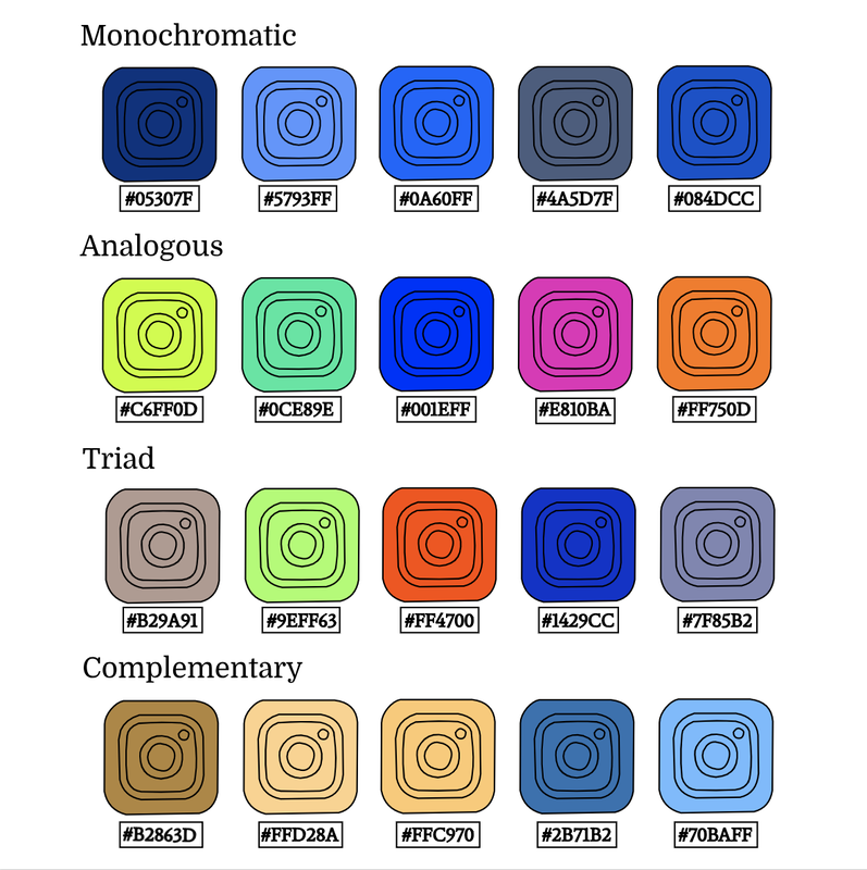 |
AuthorHi, my name is Karis. This blog is used for my photography class! Archives
October 2019
Categories
All
 This work is licensed under a Creative Commons Attribution-NonCommercial-NoDerivatives 4.0 International License. |


 RSS Feed
